


In forty years of printing for interior designers, we've learned that the finish is where most projects either land or miss. Not the image. Not the frame. The surface. A matte giclée on cotton rag reads completely differently than the same file on metallic paper behind museum glass — and the difference shows up the moment the room's lighting hits it.
The problem is that most designers don't get to see the finish until the print arrives. They're choosing from swatches in a catalog or thumbnails on a screen, and neither tells the truth about how a surface behaves in real light, at real scale, on a real wall. That's the gap we've spent four decades closing at our Chelsea and Hillside showrooms.
Here's what we think every designer should know about custom print finishes before the next spec goes out — drawn from the work we do every week across every market we serve.
Key Takeaways
- The finish controls how a print reads in the room — it's the most underspecified decision in most design projects.
- Matte, lustre, metallic, and canvas each respond differently to natural and artificial light. Always proof in the intended lighting.
- Substrate weight and texture affect perceived value as much as the image itself.
- In-house proofing against the actual frame and glazing catches problems that screen proofs never will.
The Finish Is the First Thing the Eye Registers
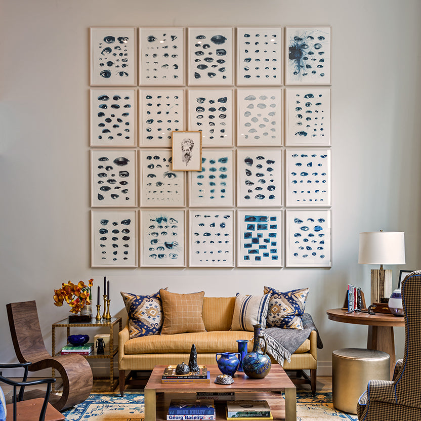
Before your client reads the image, they read the surface. A glossy print under glass in a south-facing living room throws glare from ten feet away. A matte print in a dim hallway disappears into the wall. We see this mismatch constantly — a designer picks a beautiful image, sends it to an online printer, and the result looks flat or harsh because nobody matched the finish to the environment.
Skyframe offers interior designers over twenty custom print finish options — including matte cotton rag, lustre, satin, metallic, high-gloss, and stretched canvas — each selected to match specific lighting conditions, frame materials, and room environments, with in-house proofing against the actual frame before production.
We've printed the same file on four different surfaces for the same designer, hung them side by side in our showroom, and watched the reaction. The differences are dramatic. What reads as moody and editorial on matte cotton rag reads as commercial and glossy on lustre — same file, same color profile, completely different presence in the room.
Know Your Surfaces Before You Spec
We keep every surface option on hand at our showrooms so designers can touch, compare, and proof before committing. Here's how we think about the main categories from our printing services:
Matte cotton rag is the workhorse for residential fine art. No glare, deep blacks, and a tactile texture that reads as premium from across the room. It's what most galleries specify, and it's what we recommend for any piece that needs to hold its own without glass. The tradeoff is that colors sit slightly muted compared to lustre — which is usually the point.
Lustre and satin sit in the middle. Slight sheen, richer color saturation than matte, minimal glare. This is the finish most photographers request because it balances vibrancy with subtlety. For a residential project with mixed lighting — some natural, some recessed — lustre is often the safest call.
Metallic and high-gloss are statement surfaces. The paper itself has a pearlescent or mirror-like base that gives the image a three-dimensional quality. We use these for contemporary work, black-and-white photography that needs punch, and commercial spaces where the print competes with other visual noise. They're not forgiving — any imperfection in the file shows — but when they work, nothing else comes close.
Canvas gives you texture and scale without glass. We stretch and frame canvas in house, which means the tension, gallery wrap depth, and edge finish are all controlled in one production run. For oversized pieces in hospitality — hotel lobbies, restaurant feature walls — canvas is often the most practical choice because it eliminates glazing weight and reflection entirely. For more on how large format printing works in retail and hospitality spaces, see our guide to large format printing for commercial displays.

Lighting Changes Everything About a Finish
We've installed prints in spaces where the designer loved the proof in our showroom but hated it on the wall. The variable was always light. A matte print that looked rich under our controlled gallery lighting looked washed out under the client's recessed LEDs. A metallic print that popped in a bright showroom turned into a mirror in a room with a west-facing window.
The fix is simple but almost nobody does it: proof the print under the actual lighting conditions. When that's not possible — and it usually isn't until the install — we ask designers to tell us the light temperature, fixture type, and which direction the wall faces. That's enough for us to recommend a finish and run a test print that accounts for the environment. Forty years of doing this has given us a library in our heads that no swatch book can replace.
For designers working on custom framing projects with specific lighting constraints, we recommend requesting a physical proof on the intended substrate before approving the full production run — a step that adds one day but eliminates costly reprints.

Weight and Texture Signal Value
There's a reason a 310gsm cotton rag print feels different in your hands than a 200gsm photo paper. Weight signals quality before the eye even processes the image. A 2025 haptics study by Sappi and Clemson University found that consumers are 50% more likely to perceive a product as premium after touching a heavier, textured surface twice (Sappi/Clemson University, 2025). We've watched clients pick up two prints of the same photograph — one on heavy rag, one on standard photo stock — and consistently reach for the heavier one. They can't always articulate why. They just know it feels right.
When we produced print programs for Ralph Lauren, every substrate had to meet a weight and texture standard that matched the brand's material language. The same thinking applies to any residential project where the designer has already specified Italian marble, hand-finished hardware, and custom millwork. The print surface needs to belong in that material palette. A thin, smooth photo paper next to a hand-troweled plaster wall is a disconnect the client will feel even if they can't name it.
This is where our custom framing operation becomes part of the finish conversation. The frame moulding, the mat, the glazing, and the print surface all need to work as one system. When printing and framing happen under one roof, we can test the complete assembly before it ships — substrate against mat, mat against moulding, glazing against all of it.
Always Proof Against the Frame
Screen proofs lie. They lie about color, they lie about texture, and they especially lie about how a finish interacts with a frame. We proof every custom print job on the actual substrate, at a section of the actual size, and we hold it against the moulding sample before the full run starts. It takes an extra day. It saves weeks of reprints.
The most common mistake we see from designers working with outside printers is approving a print on screen, sending it to a separate framer, and seeing the assembled piece for the first time at the install. By then it's too late to fix a color cast that the mat amplifies, or a surface sheen that fights the glazing. Our process catches that at the proof stage because the print and the frame are being built in the same room by the same team.

If you're specifying prints for a project and want to see how different finishes perform with your chosen frames, book a consultation and bring the file. We'll print test strips on every surface that makes sense for the space, hold them against your moulding options, and you'll leave knowing exactly what the final piece will look like on the wall.
Frequently Asked Questions
What print finish is best for residential interiors?
Matte cotton rag is the most popular finish for residential fine art printing. It produces no glare, deep black tones, and a tactile premium texture. Lustre is the better choice for rooms with mixed natural and artificial lighting. Skyframe recommends proofing both finishes against the actual frame and glazing before committing to a full production run.
Can I see finish samples before ordering?
Yes. Skyframe's Chelsea and Hillside showrooms keep every substrate option on hand — matte, lustre, metallic, canvas, and specialty papers. Designers can visit, compare surfaces side by side, and request complimentary test prints on their own files during a consultation.
Does the print finish affect framing options?
Yes, directly. A glossy print behind glass creates double reflections. A textured canvas requires a float frame rather than a traditional mat. Skyframe specs the finish and the frame together as one integrated system — printing and framing happen under one roof so the materials are tested against each other before production.
What finish works best for large format prints?
Canvas is the most practical finish for oversized prints in hospitality and commercial spaces because it eliminates glass weight and reflection. For residential large format work, matte or lustre on heavy rag stock (310gsm+) holds its visual presence at scale. Metallic finishes work for high-impact contemporary pieces but require controlled lighting to avoid mirror effects.
How do I specify a print finish when ordering from Skyframe?
Send Skyframe the file, the room's lighting type and wall color, and we'll recommend the right surface. Designers can also book a consultation at our Chelsea or Hillside showroom to review physical samples and test prints in person. Visit our service areas page for all locations.
We've been printing and framing for interior designers across New York, New Jersey, and Miami for over four decades. If you're working on a project that needs custom print finishes matched to the space, we'd love to help with your next project. The finish is worth getting right — and it's a lot easier to get right when your printer and your framer are the same team.


